Orange: Correlogram: Difference between revisions
From OnnoCenterWiki
Jump to navigationJump to search
Onnowpurbo (talk | contribs) Created page with "Sumber: https://orange.biolab.si/widget-catalog/time-series/correlogram/ Visualize variables’ auto-correlation. Inputs Time series: Time series as output by As Timese..." |
Onnowpurbo (talk | contribs) No edit summary |
||
| Line 8: | Line 8: | ||
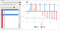
In this widget, you can visualize the autocorrelation coefficients for the selected time series. | In this widget, you can visualize the autocorrelation coefficients for the selected time series. | ||
[[File:Correlogram-stamped.png|center|200px|thumb]] | |||
Select the series to calculate autocorrelation for. | Select the series to calculate autocorrelation for. | ||
| Line 14: | Line 16: | ||
Choose to plot the 95% significance interval (dotted horizontal line). Coefficients that are outside of this interval might be significant. | Choose to plot the 95% significance interval (dotted horizontal line). Coefficients that are outside of this interval might be significant. | ||
See also | ==See also== | ||
Periodogram | Periodogram | ||
Revision as of 00:27, 26 January 2020
Sumber: https://orange.biolab.si/widget-catalog/time-series/correlogram/
Visualize variables’ auto-correlation.
Inputs
Time series: Time series as output by As Timeseries widget.
In this widget, you can visualize the autocorrelation coefficients for the selected time series.

   Select the series to calculate autocorrelation for.
   See the autocorrelation coefficients.
   Choose to calculate the coefficients using partial autocorrelation function (PACF) instead.
   Choose to plot the 95% significance interval (dotted horizontal line). Coefficients that are outside of this interval might be significant.
See also
Periodogram