Orange: Correlogram: Difference between revisions
From OnnoCenterWiki
Jump to navigationJump to search
Onnowpurbo (talk | contribs) No edit summary |
Onnowpurbo (talk | contribs) No edit summary |
||
| Line 3: | Line 3: | ||
Visualize variables’ auto-correlation. | Visualize variables’ auto-correlation. | ||
==Input== | |||
Time series: Time series as output by As Timeseries widget. | Time series: Time series as output by As Timeseries widget. | ||
| Line 11: | Line 11: | ||
[[File:Correlogram-stamped.png|center|200px|thumb]] | [[File:Correlogram-stamped.png|center|200px|thumb]] | ||
* Select the series to calculate autocorrelation for. | |||
* See the autocorrelation coefficients. | |||
* Choose to calculate the coefficients using partial autocorrelation function (PACF) instead. | |||
* Choose to plot the 95% significance interval (dotted horizontal line). Coefficients that are outside of this interval might be significant. | |||
==See also== | ==See also== | ||
Revision as of 23:23, 29 January 2020
Sumber: https://orange.biolab.si/widget-catalog/time-series/correlogram/
Visualize variables’ auto-correlation.
Input
Time series: Time series as output by As Timeseries widget.
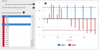
In this widget, you can visualize the autocorrelation coefficients for the selected time series.

- Select the series to calculate autocorrelation for.
- See the autocorrelation coefficients.
- Choose to calculate the coefficients using partial autocorrelation function (PACF) instead.
- Choose to plot the 95% significance interval (dotted horizontal line). Coefficients that are outside of this interval might be significant.
See also
Periodogram