Orange: Interactive Visualizations
From OnnoCenterWiki
Sumber: https://orange.biolab.si/workflows/
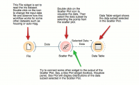
Most visualizations in Orange are interactive. Scatter Plot for example. Double click its icon to open it and click-and-drag to select a few data points from the plot. Selected data will automatically propagate to Data Table. Double click it to check which data was selected. Change selection and observe the change in the Data Table. This works best if both widgets are open.
